.Sicky.
 Happy Little Boozer
Posts: 179
|
Kira
Nov 27, 2006 23:48:47 GMT
Post by .Sicky. on Nov 27, 2006 23:48:47 GMT
This is the first of a set of two. One for me and one for my cousin. We're dweebs. Naturally I did mine first because I had some idea how I wanted it to be. The colours are not just because I like them or because I use them too much, but in the actual anime he's depicted in red. 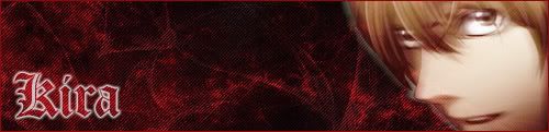 |
|
.Sicky.
Happy Little Boozer
Posts: 179
|
Kira
Nov 28, 2006 23:07:26 GMT
Post by .Sicky. on Nov 28, 2006 23:07:26 GMT
Okay, instead of starting a new thread.. I thought I'd just add my new Kira sig on here! Magic.  Tada! Same size at the L one, so it sorta matches better. ^_^ |
|
|
|
Kira
Nov 29, 2006 15:40:34 GMT
Post by Richard El Britannia on Nov 29, 2006 15:40:34 GMT
Okay, I'll rate the first one, first.
Background:
Quite interesting. I really like the style, but I think you could add more depth to it.
Stock:
This is where I feel the most improvement could be made. The stock could've been positioned better. Having it right at the edge gives too much empty space in the middle. Also, I think you may have blurred a little too much. Also, mess around with overlay and softlight and stuffs. That'll be a nice touch when blending.
Text:
Brilliant! I really like how the text has been done. No improvements need to be done there, really.
Okay, now onto the next one.
Background:
I like the loveheart pattern in the background and the blood is a nice touch, but I think you could've blended the blood a little better. Lower the opacity or something. Even then, I feel it looks a bit empty, though. Try thinking of something to make the background more interesting.
Stock:
Colouring is nice and the blurring effect looks pretty good this time. Can't really gave any suggestions here.
Text:
The font isn't great and the effects used make it look too much like the blood in the background. Try to make it stand out a little more.
|
|
.Sicky.
Happy Little Boozer
Posts: 179
|
Kira
Nov 29, 2006 18:17:53 GMT
Post by .Sicky. on Nov 29, 2006 18:17:53 GMT
Just to confirm, it wasn't intended to be blood in the background. It was meant to be in the same sort of style and the Kira one with the waves and such.
I'm glad you noticed the heart touch. >.> That's the fan girl in me!
I do prefer the text on the first one, almost looks embroided to me. If that makes sense.
The reason the stock was placed on that side on both is because I was already planning the L sig. They're against each other in the Anime, so I was doing them as a pair.
Thanks for rating!
|
|
.Sicky.
Happy Little Boozer
Posts: 179
|
Kira
Nov 29, 2006 18:19:26 GMT
Post by .Sicky. on Nov 29, 2006 18:19:26 GMT
Oh and by the way, both were a mix of all different tutorials. Some of your's and some from other sites. I also did a lot of experimenting for me, because I like to stick to what I know!
|
|