Crypto
 Elite Exorcist
Posts: 370
|
New
Jul 12, 2007 17:14:58 GMT
Post by Crypto on Jul 12, 2007 17:14:58 GMT
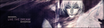
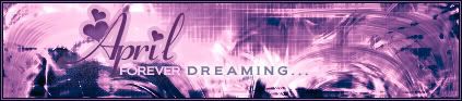
 Rates please. =] Quite Happy with this one. |
|
Otzlowe
 Enigmatic Horror
How many miles to heaven? I think I'm getting close.
Enigmatic Horror
How many miles to heaven? I think I'm getting close.
Posts: 669
|
New
Jul 14, 2007 1:25:43 GMT
Post by Otzlowe on Jul 14, 2007 1:25:43 GMT
... I hate you so very much. >.<
I stop designing for a while, and you get LOADS better.
... Must... not... let... happen... >_O
*Goes off to design*
Translation = It's good! ... But why must you be better than me?!?! D:
/cry
|
|
Crypto
Elite Exorcist
Posts: 370
|
New
Jul 14, 2007 11:03:37 GMT
Post by Crypto on Jul 14, 2007 11:03:37 GMT
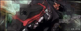
 Im not better... Your just being Lazy. xD Like i said, first one in a while i actually like. =] And thanks
|
|
Otzlowe
Enigmatic Horror
How many miles to heaven? I think I'm getting close.
Posts: 669
|
New
Jul 17, 2007 17:17:03 GMT
Post by Otzlowe on Jul 17, 2007 17:17:03 GMT
Did you use fibers on the left side? That's what it kind of looks like to me. I might be wrong though.
|
|
Crypto
Elite Exorcist
Posts: 370
|
New
Jul 17, 2007 22:33:56 GMT
Post by Crypto on Jul 17, 2007 22:33:56 GMT
I used a 'Flame' That i made using Apophysis.
|
|
♥april
.:| I need you like a poet needs the pain |:.
Posts: 205
|
New
Jul 28, 2007 19:53:57 GMT
Post by ♥april on Jul 28, 2007 19:53:57 GMT
I like the effects you used in the top left corner... it's very nice.. I think maybe you should have played around with the colors of the stock tho.. the red doesn't match the rest of the sig.. maybe if it was more of an orangish like what we see in that top left corner.. nice job overall  |
|
|
|
New
Aug 11, 2007 16:19:59 GMT
Post by Surreptitious Cardboard Box on Aug 11, 2007 16:19:59 GMT
I think the stock stands out a bit too much; it seems to be more opaque than the background, apart from around the edges where it has been blended in, so you'll want to blend the centre of the stock image in a bit more too. I like the style, though. I used to love using the pixellate filter.
|
|


 Mecha-admin