Crypto
 Elite Exorcist
Posts: 370
|
Post by Crypto on Nov 25, 2006 17:21:40 GMT
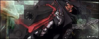
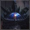
[ALUCARD!]  [VENOM]  [VENOM # 2!]  Hope you like, Please rate. |
|
Otzlowe
 Enigmatic Horror
How many miles to heaven? I think I'm getting close.
Enigmatic Horror
How many miles to heaven? I think I'm getting close.
Posts: 669
|
Post by Otzlowe on Nov 25, 2006 17:52:22 GMT
I say this now. I hate you for the venom sig.  I'm not being entirely serious, it's just that I've been tweaking around with a venom signature for my friend for some time, and yours beats my previous attempts by quite a bit. Though... I'm not fond of that particular Venom stock. The alucard sig is nice too, and I can't complain too much about the bared side, as you balanced the light and dark there. So, all in all, congrats! (And, I plan to show you up with a Venom sig of my own.  ) |
|
Crypto
Elite Exorcist
Posts: 370
|
Post by Crypto on Nov 25, 2006 21:04:02 GMT
Thanks rate dude.
And im looking forward to your sig.
P.S what about the first venom one?
|
|
♥april
.:| I need you like a poet needs the pain |:.
Posts: 205
|
Post by ♥april on Nov 26, 2006 5:48:26 GMT
P.S what about the first venom one? that was actually the sig outta those three that caught my attention first. I looooove that shade of blue that you used... it's so mesmerizing.. to me at least  After seeing the second one though, is the tongue of the stock image in the first venom sig supposed to be blurry like that? That's the only thing that I don't like. Other than that, it's a really great sig. |
|
Crypto
Elite Exorcist
Posts: 370
|
Post by Crypto on Nov 26, 2006 10:52:14 GMT
No, To be honest the tounge isnt ment to be blury like that, Its because of the effect i did on the layer below.
|
|
Otzlowe
Enigmatic Horror
How many miles to heaven? I think I'm getting close.
Posts: 669
|
Post by Otzlowe on Nov 26, 2006 21:05:03 GMT
I'm not sure I really like the venom stock you used in the first one, and the general blurriness. I can see the attempt for a smudge sig... but it looks more fuzzy to me than anything.
The vibrant blues and everything are nice, but the general blurriness, and just the stock, don't appeal to me that much.
The text is okay, but it's only pixle font, so, nothing big there.
I'd say it's good, but it just doesn't fit my style.
|
|
.Sicky.
 Happy Little Boozer
Posts: 179
|
Post by .Sicky. on Nov 27, 2006 23:38:52 GMT
I adore the first Venom one, besides one thing. The way you portrayed 'Venom' I think it's almost too fussy. The sig is good because of the stock [for me anyway]. It over powers you with the size of Venom and the way he's shown. To be perfectly honest I think the font ruins it completely [and I'm a font whore!] . Alucard - I love him, don't love the sig unfortunately. Just doesn't smack me in the face like the first Venom one. 2nd Venom - I love the way he's clear from the background, makes him stand out very nicely. Font works on that one, only just. Be more creative with the font! Everyone uses pixel. Get groovy with it. Over all - Well done! I'm shit at sigs, so you can ignore this if you wish. |
|
Crypto
Elite Exorcist
Posts: 370
|
Post by Crypto on Dec 3, 2006 16:13:08 GMT
Why ignore it? You make Graphics So i welcome your views with open arms.
|
|