Crypto
 Elite Exorcist
Posts: 370
|
Post by Crypto on Jan 27, 2007 20:28:38 GMT
Dont like naruto but ahh well. Lol  And FMA  ;D Rate? |
|
|
|
Post by Richard El Britannia on Jan 30, 2007 17:09:22 GMT
Well, sorry about the wait, but I'm finally gonna start rating and stuffs again.
We'll start with the Kakashi siggy.
Background:
I don't see much going on here. I reckon you could've done a little more. The right side of Kakashi is a bit bland. However, I like those rounded arrow thingies to the left of Kakashi.
Stock:
I can tell there's been an attempt to blend it, but I reckon you could've done a bit better. Try duplicating layers and messing around with different blending styles and blending options on the layers.
Text:
To be honest, I don't really like the font choice here. Also, I think it kinda sticks out too much. Lower the opacity a bit or something.
Overall:
To be honest, not one of your good ones. To me, it seems as if you've rushed it a bit. Try making the improvements and see if they help.
Righto, now onto the second one.
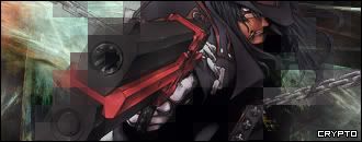
Background:
Seems like a simple smudging sig with a few filters in there, if I'm not mistaken. Well, it's not bad, but far from perfect. You should work on lighting effects. Make the focal point - your stock - brighter than the rest of the piece and the sides around the outside, darker.
Stock:
It's been blended nicely, but I think it should be less apparent towards the top left.
Text:
Like your other sig, I don't like the font choice here. Also, the positioning is kinda bad, too. Try and make the words closer together and placed in a more interesting way. Lower the opacity a tad, too, perhaps.
Overall:
Overall, MUCH better than the first sig you posted, but there could be a few improvements you could make.
|
|
Crypto
Elite Exorcist
Posts: 370
|
Post by Crypto on Jan 30, 2007 17:25:56 GMT
Yea thanks um.
I actulay didnt use msuc smudge.
and i can never find any good fonts.
|
|