Otzlowe
 Enigmatic Horror
How many miles to heaven? I think I'm getting close.
Enigmatic Horror
How many miles to heaven? I think I'm getting close.
Posts: 669
|
Post by Otzlowe on Jul 20, 2006 20:48:51 GMT
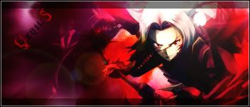
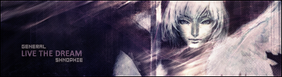
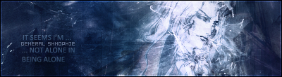
Ooookay! I'm having a ton of fun with all this. Here is my new Green Goblin set that I had a TON of fun making. These are my 4th, 5th, and 6th graphics I've made. So far I'm -really satisfied with the Siggy. I had help from my brother, as he supplied some extra stocks for me (the others I'm going to use in a splash image). Avatar 1: 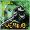 (This is one I made from scratch, rather than using the design straight from the signature.) Avatar 2:  (I used the Signature design for this one.) Signature:  (This siggy I made in... 5 hours? Took longer because I had to do some of my own cutting.) Feel free to rate. ^^ |
|
|
|
Post by Surreptitious Cardboard Box on Jul 21, 2006 12:46:43 GMT
I'll rate the sig and leave the avs for someone else ^^.
Background:
I'm actually loving the majority of this background. The right-hand side is pretty good. I can see you used some custom shapes in there, then went over with a bit of grey paint, possibly? The bg also blends in quite well with the right-hand side of the stock and with the face on the left-hand side of the graphic.
Stock:
This stock image is a much better size than the images have been in your other graphics, though I still think you could enlarge it a little bit more - let it cut off at the top of the head a bit, or something. Experiment with multiple layers of the stock image to help blend it in more with the background.
Text:
The 'The Green Goblin' text is quite striking. The colour suits the mood of the graphic but you might want to set the blending mode ot overlay or softlight and duplicate the layer to let it blend in with the bg more.
The subtext is very hard to read - try a different shade of yellow and don't give it such a strong outer glow (I think that's what you've done). You might also want to reposition it as well.
Other comments:
When using scanlines, you went to set the opacity to about 15-30%, depending on the lighting of the graphic. I like how you've used the eraser to get rid of it in various parts, though. The border's pretty strong too, though you may want to lower the opacity of the inside white pixel border a bit.
Definitely your best graphic. Keep the good work up.
|
|
Otzlowe
Enigmatic Horror
How many miles to heaven? I think I'm getting close.
Posts: 669
|
Post by Otzlowe on Jul 21, 2006 17:07:38 GMT
Thanks for the rate. Pretty much, almost all of what I did, I did on purpose... since I experimented with it a bunch of different ways, and stuck with the ones that appealed to me more. Just gonna touch on some of the things you said: Yes, that is grey paint I used on the right hand side of the background, and I blotched a bit with a 65% opacity eraser. I wanted the main stock to stand out a bit, just because I think he looks nice that way, I did more blending on the secondary stock (the big face behind him). I didn't really think about blending the text that way... you've given me something to think about, since I set the texts to overlay and softlight to see if it blends more, but they just make them hard to read... and I never think to use multiple layers. (*Slaps forehead*) Thanks for that tip. ^^ The glow around the sub-text, "The Permenancy" was a mistake actually, I hadn't meant to put it there, I was messing around with it, and I guess I accidentally left it on. The scan lines I also wanted to stick out more, to give it more of a comic book kind of feel (though, that's the half-tone pattern filter... but it didn't work as well in this case, so I used scan lines instead (they look better anyway). Yeah... I'll mess around with the borders next time... I've never actually took a lot of time to see how they look in different ways. (I could have set the opacity of the scan lines on the first avatar down a good bit though.  ) |
|
|
|
Post by Richard El Britannia on Jul 21, 2006 17:54:50 GMT
I'd rate, but I'd just be repeating what GS said. I agree with the points she raised.
|
|


 Mecha-admin
 )
)


