Otzlowe
 Enigmatic Horror
How many miles to heaven? I think I'm getting close.
Enigmatic Horror
How many miles to heaven? I think I'm getting close.
Posts: 669
|
Post by Otzlowe on Jul 19, 2006 17:38:34 GMT
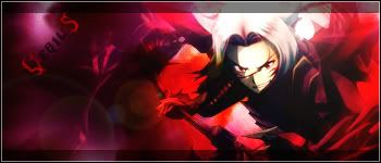
Yup... this is attempt No. 2, I tried to improve most of the things I got wrong last time... as well as use new techniques.  |
|
Ramirez
 The Reincarnation Of Benjamin Breeg
Lucifer was just an angel that was led astray...
The Reincarnation Of Benjamin Breeg
Lucifer was just an angel that was led astray...
Posts: 575
|
Post by Ramirez on Jul 19, 2006 17:47:43 GMT
Wow, i gotta say that i am really impressed. That is a HUGE improvement over last time. I find it really cool! Ok rating time.  Sorry if its not as long the heat is bugging me. First the background effect is superb, you've got a really nice effect there and you've brushed perfectly. The amount of depth you have added is spot on and helps add to the 3D effect. Also the cool little patterns that are present merge in nicely overall. The pixel stretch is also well done and is nicely subtle. They blend very well into the actual stock. Which brings me to my next point. The edges seem really nice and smooth and the image is positioned nicely on the sig. I like how you've kept his original colour as making him the same colour would likely to make people overlook Mitsurugi. (Hes great on SC eh?). One thing I might add about it is that it could be a little larger and take up a little more of the right hand side. Ctrl + T can enlarge and decrease sizes without too much distortion. Hmmm what else? Ah the text! the fonts you have picked are greatly matching and compliments the overall piece well. I prefer the Mitsurugi font as it has some styles added to it and looks nice (What is that font btw? Its snazzy). The perfect warrior is a bit lacking though. It blends in a little bit too much and is slightly hard to read. I would also make the Mitsurugi font a little larger or the other one. And the border you have chosen is simplistic yet works well! Nice job, Verius! I award you with a 7/10!! |
|
Otzlowe
Enigmatic Horror
How many miles to heaven? I think I'm getting close.
Posts: 669
|
Post by Otzlowe on Jul 19, 2006 18:19:24 GMT
Thank you Rami! ^^ I did change his color a tiny bit... it's more reddish, but I kept it as standing out, because he just looks better like that. I didn't make him bigger, because I wanted to get more of him in the sig, rather than having a particular part of him sized larger. (Mitsurugi is one of my favorites on SC, he's awesome.  ) (The font is called... Malagua) I still had some difficulty getting the fonts right, but up in that corner there really wasn't much I could do... most of the other effects and such were blending in the back too much, and would have been completely impossible to read. I didn't really worry too much about the text at the top, since I don't actually -mean- for people to see it, it's just there if someone does, so that it's not bare. You're right though, I should have maken his name bigger... I just have this weird thing about liking names to be subtle sometimes. I didn't want to take the focus off of anything else because of the text. Thank you for the great compliments and the rate. ^_^ |
|
Ramirez
The Reincarnation Of Benjamin Breeg
Lucifer was just an angel that was led astray...
Posts: 575
|
Post by Ramirez on Jul 19, 2006 18:23:24 GMT
Ahhh i see, don't be afraid to have some bits not showing on the sig. Sometimes that enhances the piece. I do it quite a lot. >_< LOL A good thing to do is just download LOADS (and when i say loads i means hundreds! ) and just all trying them out. Gives you a variety lol. And no problem, doing rates is easy enough. |
|
Otzlowe
Enigmatic Horror
How many miles to heaven? I think I'm getting close.
Posts: 669
|
Post by Otzlowe on Jul 19, 2006 18:27:59 GMT
I know... I looked at it larger first... but I liked the fact that when you saw more like this, you got more sense of the motion. That.. and the original picture isn't the best quality ever... sooo Yeah, I'll probably download more later when I have more time... I just picked up a few that looked nice and used them.  (Er... I have more than I used though. XD) |
|
|
|
Post by Richard El Britannia on Jul 19, 2006 18:42:54 GMT
I'll rate both of the siggies you've posted later on. For some reason, none of the PB images will load for me so I can't see them. >_<
|
|
Otzlowe
Enigmatic Horror
How many miles to heaven? I think I'm getting close.
Posts: 669
|
Post by Otzlowe on Jul 19, 2006 18:47:40 GMT
Mmm... I had that problem like... two days ago... it was gone by the next day though. *Scratches chin* Not sure what's causing it though.
|
|
Ramirez
The Reincarnation Of Benjamin Breeg
Lucifer was just an angel that was led astray...
Posts: 575
|
Post by Ramirez on Jul 19, 2006 18:49:45 GMT
...Probaby IE. >_<...
|
|
Otzlowe
Enigmatic Horror
How many miles to heaven? I think I'm getting close.
Posts: 669
|
Post by Otzlowe on Jul 19, 2006 19:06:34 GMT
*Has Firefox* It's not my browser. XD |
|
|
|
Post by Richard El Britannia on Jul 20, 2006 18:19:02 GMT
Same! Right, now for the rate as I promised. Background:I can see a grunge brush has been used for the background, but it wasn't instantly recognisable. The brushing seems to be dark mostly, try doing some lighter brushing too. Maybe try using depth too. Levels might help with this, also. I like the other (brushes?) that have been used too. The circles and stuff look pretty good. Stock:The stock image looks a bit small for the size of the siggy you have. It leaves a lot of space on the left hand side of the sig and you should try to avoid that unless you have something else to put there. The blending doesn't look too bad here though, so don't worry too much about that. Text:The 'Mitsurugi' text looks good. The effects and font choice are pretty good, although it looks far too small. I'd make it bigger. Also, never have the sub text, which I presume is 'the perfect warrior' any bigger than the main text, since you want more attention to the main text. Pixel fonts usually look good for sub-text. |
|
Otzlowe
Enigmatic Horror
How many miles to heaven? I think I'm getting close.
Posts: 669
|
Post by Otzlowe on Jul 20, 2006 20:28:37 GMT
One think I want to mention (Thanks for the rate, btw.) is, at the time I didn't have any pixel text, and I wasn't sure what to use... *shrug* Mm... I would have done lighter brushing, but I decided to stick with what I had. |
|