Otzlowe
 Enigmatic Horror
How many miles to heaven? I think I'm getting close.
Enigmatic Horror
How many miles to heaven? I think I'm getting close.
Posts: 669
|
Post by Otzlowe on Jul 18, 2006 21:22:28 GMT
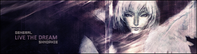
Now, this isn't going to be the prettiest sig out there, and I have some terrible font selections (need to update that... somehow), but yeah... here it is. (Normally the background would be darker, but I'm having trouble finding good stock photos without the white backgrounds on them... and I'm not sure how much sitting and erasing all the white would help.  )  Edit: Btw, please rate. I'd love the see what you think! ^^ (Besides, considering how helpful you all are... chances are your comments will help me a ton.  |
|
Ramirez
 The Reincarnation Of Benjamin Breeg
Lucifer was just an angel that was led astray...
The Reincarnation Of Benjamin Breeg
Lucifer was just an angel that was led astray...
Posts: 575
|
Post by Ramirez on Jul 19, 2006 11:04:05 GMT
Well for your first sig it sure beats mine.  Well lets get to business shall we? The main thing I like most about this is that you've managed to produce a very good background for a beginner and it actually looks pleasing on the eye. The pixel stretch you used there is positioned nicely. (I prefer them to be behind the main image). The texture in the background looks quite rocky to me and i quite like the effect. The swirly effects in the background are quite unique which is good and I urge you to show that throughout making sigs as it sets you apart and you could create trends etc... But it would be better in a different colour. And maybe with a faint drop shadow (Layer >> Layer styles >> drop shadow) Righty, next thing, the image seems to be of good quality which is a high priority when making sigs. Having a ruined image in a crappy JPEG file does let it down completely. However i have one slight complaint with the image. Its not too clear, quite hard to make out the character. Maybe positioning him different in the layers would help. Or alternatively, while using the layers palette, look for a sort of rectangle at the bottom of the list and find create vector mask and then place some brushes over him. Help to blend it nicely while retaining the actual image. Another point to remember is the importance of borders. They help distinguish your image from the surface behind it. Mostly a 1px black border looks effective. To do this, go to your top layer, create new layer, edit, stroke, 1px black. And then you have a simple border.  And lastly as for the text; its always a challenge doing the text of a piece. I myself find that my text always lets me down. And because you're a beginner this is to be expected. You could try giving it a 1px black stroke by changing it's layer styles. www.dafont.com also has an extensive archive of many fonts you can use. Overall i'll give this piece a 4/10. Its a good score for a beginner and especially for your first sig! Looking forward to more graphical pieces. Oh and btw, erasing the background does help. You could try using the magic wand tool to select all of the white parts and hitting the delete key. That is a quick way of doing things. Hope my rate is helpful! |
|
Otzlowe
Enigmatic Horror
How many miles to heaven? I think I'm getting close.
Posts: 669
|
Post by Otzlowe on Jul 19, 2006 11:48:55 GMT
Definately helpful Rami, thanks. ^^ (Btw, do you have any suggestions on places to get stock images? I'm having trouble finding decent ones without already pre-done backgrounds. Not just white stuff.) On the fuzziness of the character... it just seemed to come out that way, and I thought it made him look pretty cool compared to what I'd had before that. I knew it would be a problem point... but it was more of a thing for myself. Again, thank you for your help.  |
|
Ramirez
The Reincarnation Of Benjamin Breeg
Lucifer was just an angel that was led astray...
Posts: 575
|
Post by Ramirez on Jul 19, 2006 12:30:28 GMT
|
|
Otzlowe
Enigmatic Horror
How many miles to heaven? I think I'm getting close.
Posts: 669
|
Post by Otzlowe on Jul 19, 2006 12:35:34 GMT
Gotcha, thanks Rami. |
|
|
|
Post by Surreptitious Cardboard Box on Jul 19, 2006 13:27:00 GMT
Yeah, you can always cut renders out by yourself but that takes ages. I'd say I agree mostly with what Ram said, really. An alternative to the 1px black border is to do the following:
- Create new layer
- Press Ctrl + A (this selects the whole graphic so that the progam knows what you want to apply a border to)
- Edit ---> stroke ---> 2 px, white, overlay, 50%, then click OKAY.
- On that same layer, change the blending mode to 'overlay'.
- Create new layer, keeping the graphic selected still.
- Edit --->stroke ---> 1 px, black, normal, 100%, then click OKAY.
- Press Ctrl + D to deselect.
You can mess about with the settings but that is how I usually do my borders.
|
|
Ramirez
The Reincarnation Of Benjamin Breeg
Lucifer was just an angel that was led astray...
Posts: 575
|
Post by Ramirez on Jul 19, 2006 17:52:43 GMT
That works too lol. Thats normally how I do borders. Of course you can also do the 3 pixel border with the middle border being the overlay one. Trying different colours other than white also has some nice effects. Choosing colours from the graphical piece works.
|
|
|
|
Post by Surreptitious Cardboard Box on Jul 20, 2006 10:32:45 GMT
Yeah! Hah, I just remembered that I always used to use 3-pixel borders. Maybe I'll use one for my next graphic ...
|
|
|
|
Post by Richard El Britannia on Jul 20, 2006 18:08:29 GMT
First siggy? Damn, the newbies to PS get better and better! My first siggy sucked! Right ... Background:I like it, the effect looks cool and I can tell you've used a pixel stretch for colouring which is always nice. (Is this an attempt at a tutorial I made, by the way? It looks a bit familiar.) One thing that I can see is that the background doesn't look like it has any lighting effects, or as I call it 'Depth'. I'd have a look at my depth tutorial, using curves usually helps with a lot of siggies. Stock:I really like how you've blended the stock image here, it goes wonderfully with the background, although it does look a little rough around the edges on some parts. I like the orange curvey things around him too, it almost gives the sense of movement which has turned out great. Did you do that intentionally? Text:Like you said, the font choice wasn't very good, you should download some more. I'd make the text bigger too, it isn't very noticable. I'd also add a few more effects with it too. Try setting the blending mode to overlay and either giving it a drop shadow that's close to the original text to make it stand out, or you could try using a 1 pixel stroke to give it an outline. The latter usually looks worse when using it with overlay, but it makes the text stand out and is sometimes the better choice. Other Comments:Add a border. GS said how to.  |
|
Otzlowe
Enigmatic Horror
How many miles to heaven? I think I'm getting close.
Posts: 669
|
Post by Otzlowe on Jul 20, 2006 20:33:31 GMT
Actually, yes I did use your tutorial for this one! Helped me out quite a lot. Mmm, at the time I didn't know about lighting and such... I was just eager to get working on my Siggy. XD Yeah, I made him blurry, as well as the orage curves, intentionally. After adding a Dark Strokes brush effect, it gave lines that made me start thinking, and led up to this. (Much better then it would have been if I hadn't, to tell the truth.) Heh... since I didn't have good fonts, I didn't want to make it noticeable at all. *Shrug* I have tons of fonts now. ^^ |
|


 Mecha-admin