|
|
Post by Richard El Britannia on Jul 12, 2006 17:00:03 GMT
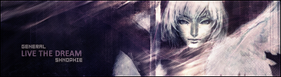
Thought I'd kick off this board by getting some opinions on my newest FMA siggy.   |
|
|
|
Post by Surreptitious Cardboard Box on Jul 12, 2006 19:00:12 GMT
It's blurry and busy and I love how you mimicked the FMA style of colouring the font. To be honest, I'm not feeling too critical right now, so I'll give you 8.5/10.
Definitely one of your better sig banners, even if I don't like red much, or Ed for that matter. Errr, I'll expand on my rate later.
|
|
|
|
Post by Richard El Britannia on Jul 12, 2006 21:57:44 GMT
It's blurry and busy? Isn't that a bad thing, lol?
Anyways, thanks for your opinion.
|
|
|
|
Post by Surreptitious Cardboard Box on Jul 13, 2006 12:08:30 GMT
No, no, I meant blurry and busy in a good way. Where you've blended the stock is where it's blurry and that works well. By busy I meant that the background isn't just a plain colour wash, which would be boring. Although I don't usually like centre-aligned stock images, it hasn't worked out too badly in this sig. I'm assuming you created multiple layers of it and applied different effects to each, right?
To improve:
- You might want to increase the size of the render ever so slightly.
- I think the text needs blending more. Don't worry about the FMA-style text but the sub-text stands out too much.
Like I said, 8.5/10
|
|
|
|
Post by Richard El Britannia on Jul 13, 2006 17:29:39 GMT
Yup, that's right. Did a few effects on multiple layers. I'll have a go at making the stock bigger, but it might make it a bit too blurred. That's it's original size. I'll do a variation in a while, thanks for your rate.  |
|
|
|
Post by Surreptitious Cardboard Box on Jul 13, 2006 17:36:22 GMT
I tried making an image bigger than it's original size with shift + drag and it didn't mess it up, so give it a go, yeah.
|
|


 Mecha-admin