♥april
 .:| I need you like a poet needs the pain |:.
Posts: 205
|
Post by ♥april on Jul 28, 2007 20:03:20 GMT
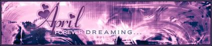
So here's my newest stuff. I made 2 versions, because with me being so incredibly indecisive, I changed my mind after making the first one.. lol.. anyway here's that one:  and here's the revised version:  I was having trouble with the brightness (especially on the 2nd one)...I think the image overall is too bright.. but when I tried to darken it, it started looking like crap, so I just said screw it and left it alone. |
|
|
|
Post by Richard El Britannia on Jul 29, 2007 7:29:54 GMT
I really like your style. It's not something very usual, and I love unique stuff. I think the backgrounds look pretty cool, but on the top one there are parts where the soft flow seems too sharp. It's mainly on the left. I can't explain it, really, but I hope you understand me.  I really like your text style, too. I dunno anything to say about that, it just looks awesome. Second one is much nicer, too. It's good you revised it. You got rid of that sharpness and it looks really smooth now. As for it being too bright, I don't think so. I think it looks good at that brightness, to be honest.  |
|
♥april
.:| I need you like a poet needs the pain |:.
Posts: 205
|
Post by ♥april on Jul 29, 2007 15:26:51 GMT
heh thanks UM  Yeah that top one, I know what you mean.. I didn't soften the wind effect enough. I'm noticing that these tend to look better on a light background. I've been told I'm good with text before I think it's because I'm too much of a perfectionist and I spend more time perfecting the text than actually making the sig.. hah xD |
|