|
|
Post by Surreptitious Cardboard Box on Nov 9, 2007 20:29:34 GMT
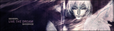
 Constructive criticism/rates, please. EDIT: Latest image. Made with Sephos in mind, but not necessarily made for him, if you get what I mean.  SECOND EDIT:  |
|
|
|
Post by LinksFan on Nov 9, 2007 20:37:27 GMT
Heh. I really do love this graphic. Textures are ace, the way you've blended the picture in is fantastic, and the poem is... Did you write that yourself or take it from somewhere? I'd have to give this a 10/10 for pure originality. Sure, your other graphics follow (from what I've seen) a style, but I haven't seen anyone else with that kind of style  |
|
|
|
Post by Surreptitious Cardboard Box on Nov 9, 2007 22:29:33 GMT
Thanks, Linksfan ^_^. Yeah, I wrote the text myself. I didn't really intend it as a poem, but I prefer to write more than just an image 'caption' when I make graphics, especially larger ones, so I tend to write a short paragraph befitting the piece.
I'm glad you like the graphic. It took me about three hours, so appreciation is always welcome xD.
|
|
|
|
Post by Richard El Britannia on Nov 10, 2007 12:25:40 GMT
I love the background, it looks brilliant. Brushing and effects used are pretty good!
There are a couple of things I think could be improved upon, though. The text is one of them. I like the font choice, but I think it's too hard to read. Perhaps make it a little higher in opacity or something? Especially the sub-text with your name. It took me a while to notice it was there.
I like the stock blending, but again, I think it's like the font. It doesn't stand out quite enough. It being a focal point for the image, wants to stand out more. I can tell it's a man, and my focus is drawn there, but I think it could be made a little more obvious.
|
|
|
|
Post by Surreptitious Cardboard Box on Nov 10, 2007 17:40:57 GMT
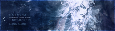
Thanks for your comments guys. I've updated the thread with another image.
|
|
|
|
Post by LinksFan on Nov 11, 2007 8:39:30 GMT
I think I like the second more. The picture blends in better. I love how the person isn't in the foreground, but is rather part of the background, yet still prominent.
Great work ^^
I agree with UM on the second one, though. The text I found quite hard to read.
|
|
|
|
Post by Surreptitious Cardboard Box on Jun 23, 2008 17:10:08 GMT
Richard's work on a new skin for another place got me inspired to use PS again, so I slopped out the paints and got to work. This is my latest result. You might not think it, but I went through a lot of colour schemes with it, before finally deciding on a very subdued, low saturation style. It's not as good as my last one, but eh, I'm just pleased to be getting back into the artistic state of mind again.
Tell me what you think peoples. I've updated the first post with the image.
|
|

 Mecha-admin